This is a usability testing I led at UCSD Design Lab. The high level objective of the study was to test specific design solutions and evaluate the effectiveness of the prototype pupillometer, thus to iterate over the current designs. Some information is removed or modified due to confidentiality.
This project showcases my analytical thinking, where I used both quantitative and qualitative data from usability testing to derive actionable insights, ensuring that the design improvements were grounded in real user feedback and needs.
Disclaimer: The visuals you see on this page are coming from my final UXR report. It is for showcasing my research reporting ability.
The lab wanted to test the current designs to determine some areas for improvement. Some key goals we have:
Usability Research Goals
Design Iteration Goals
Behavioral Data Goals
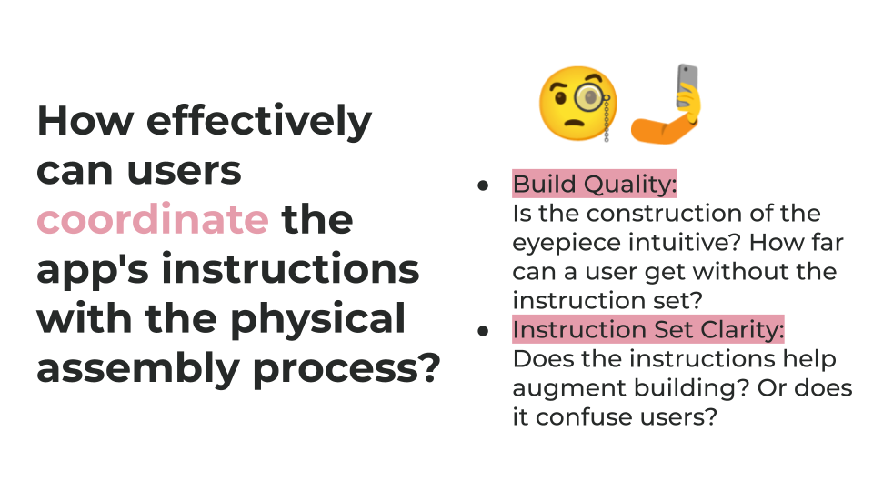
To achieve these goals, I conducted a usability study involving 10 participants to evaluate the effectiveness of the instruction set for assembling the prototype pupillometer. The study consisted of participants completing the eyepiece assembly task while I observed and collected qualitative data on their interactions, specifically focusing on their reliance on the instruction set versus the video tutorial. Additionally, feedback was gathered on the ease of attachment of the eyepiece to the phone, as well as the clarity of the visual cues and instructions provided.
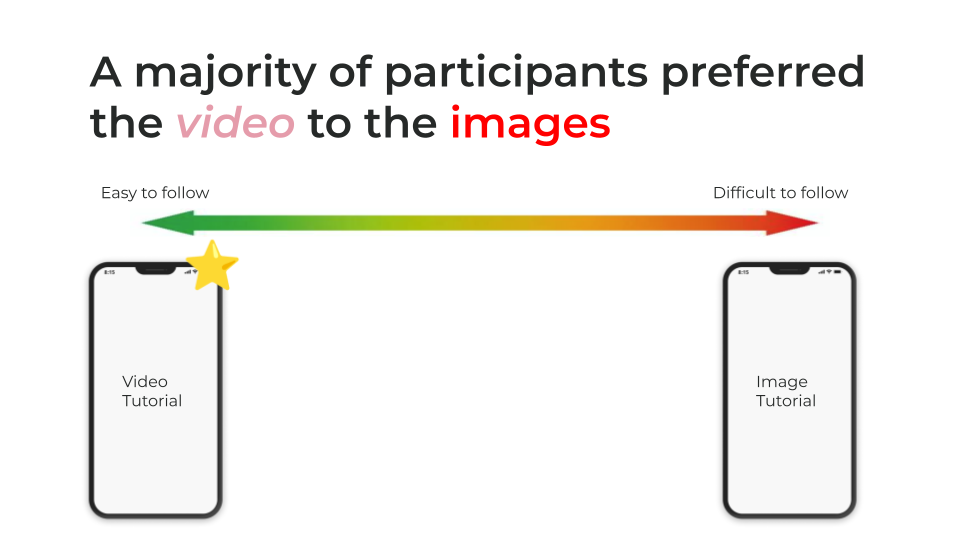
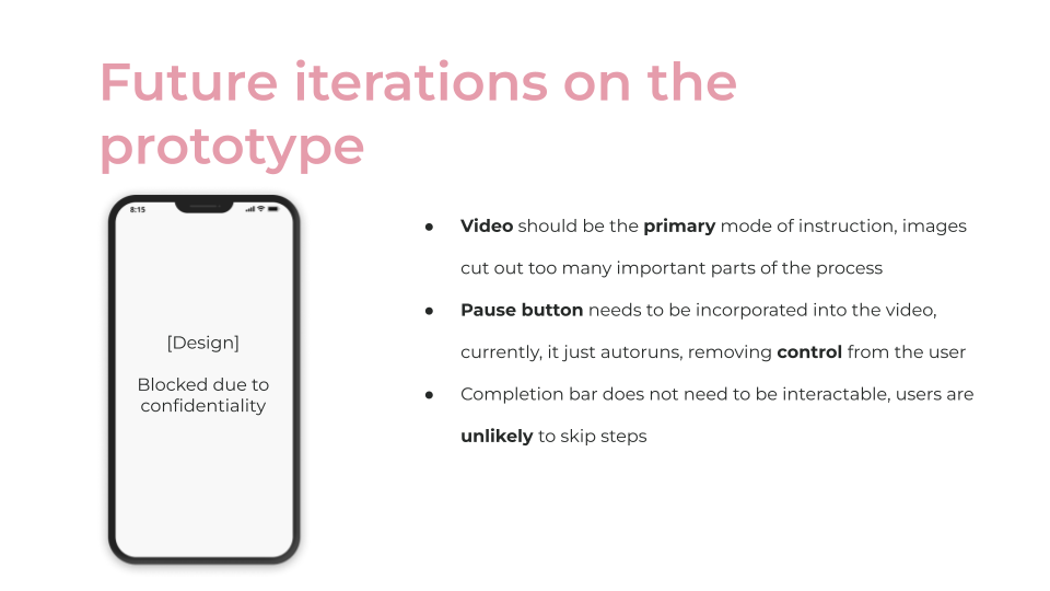
The most critical finding was that eight out of ten participants heavily relied on the video tutorial rather than the instruction set, pointing to a lack of clarity in the written instructions. The instruction set lacked clear visual cues and used ambiguous language, making the video the preferred method of guidance.
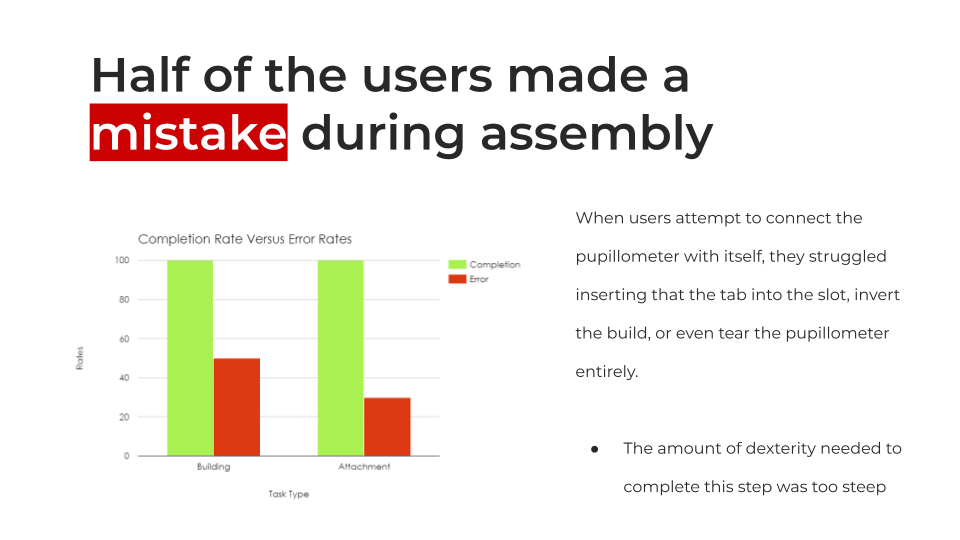
While most participants found the labeling and creasing of the eyepiece helpful, three users struggled with inserting a key component due to its dexterity demands. Participants reported that key steps in the instruction set were missing, forcing them to rely on external visuals for completion.
Attaching the eyepiece to the phone was generally easier, but six participants were confused about aligning the eyepiece with the camera, indicating a need for better alignment cues. Additionally, the completion bar was misunderstood, with most users viewing it as a notifier rather than an interactive tool.
Overall, the current design of the instruction set was ineffective at providing clear guidance, leading to a heavy reliance on the video tutorial. Without improvements to visual cues, detailed steps, and clearer language, users will continue to struggle with the self-assembly process.
For additional findings and learnings, please contact celinenguy03@gmail.com.
Design Impact
Stakeholder Collaboration Impact
Product Impact
