Adrian Tolentino
Fiona Chen
Mayra Trejo
Figma
Discord
Google Workspace
3 months
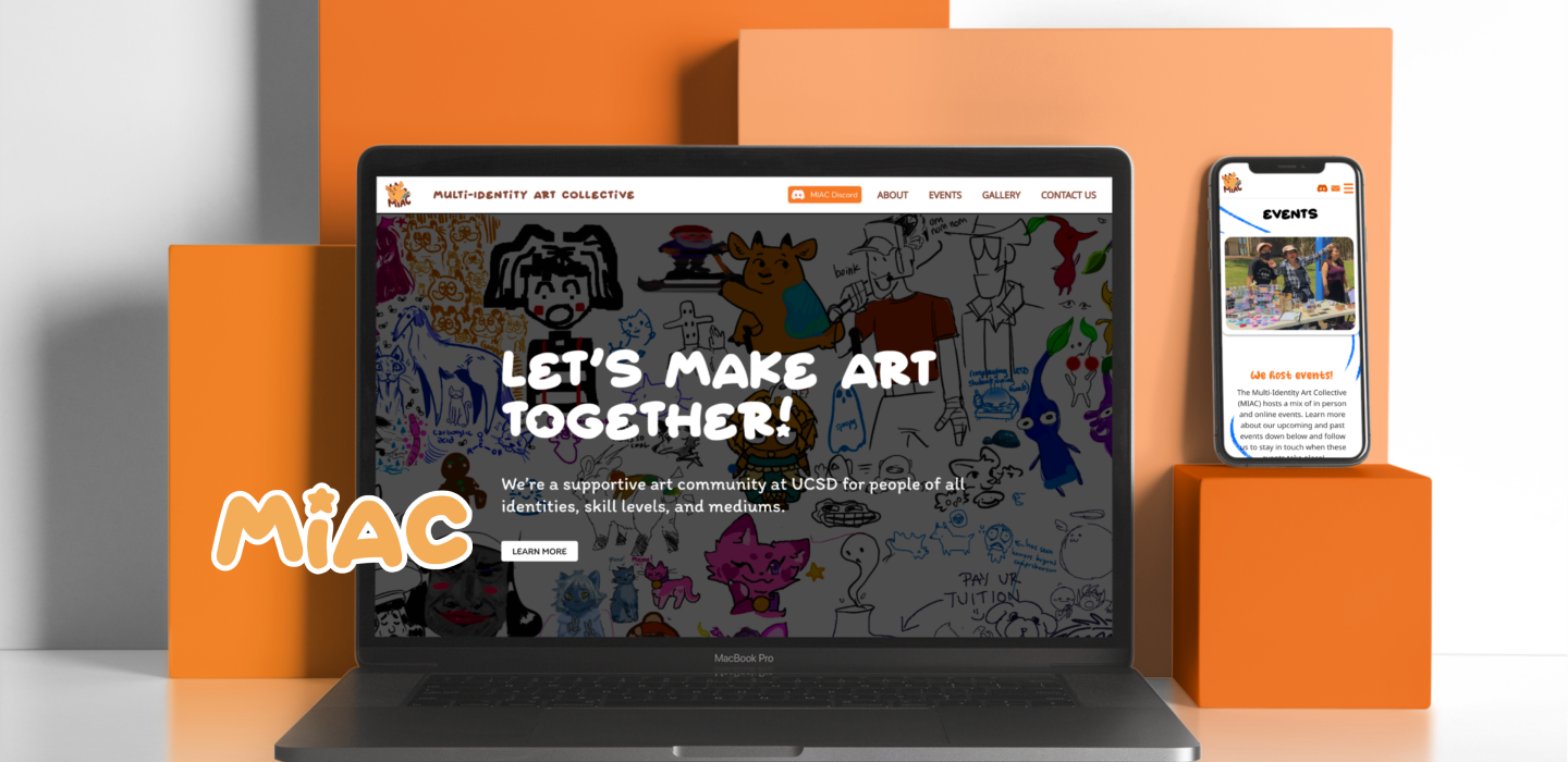
The Multi-Identity Art Collective (MIAC) at UCSD brings the art community together through inclusive practices and inviting events. To support this mission, I led a website redesign that transformed the site into a comprehensive resource hub for members and students. The new design enables users to easily locate event locations and times, driving a 40% increase in event registration for the club. This update also positioned the website as a central point for community engagement and event participation.

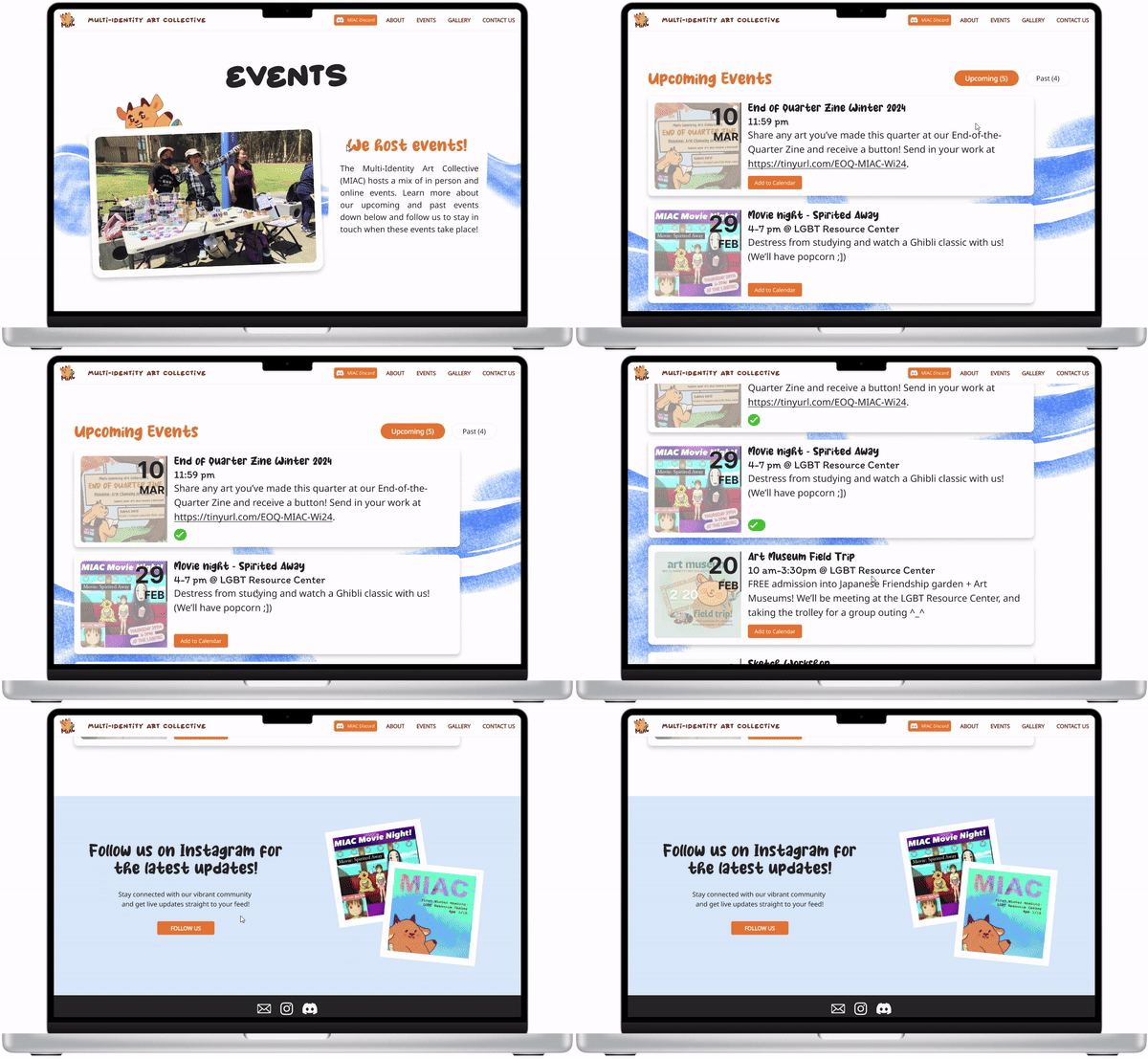
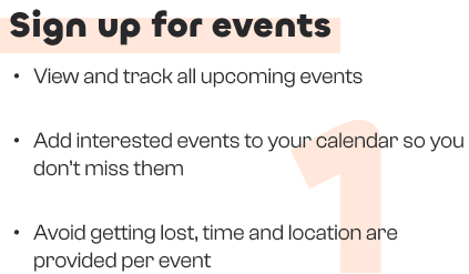
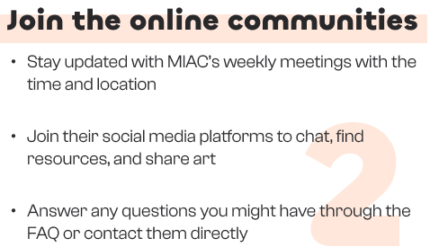
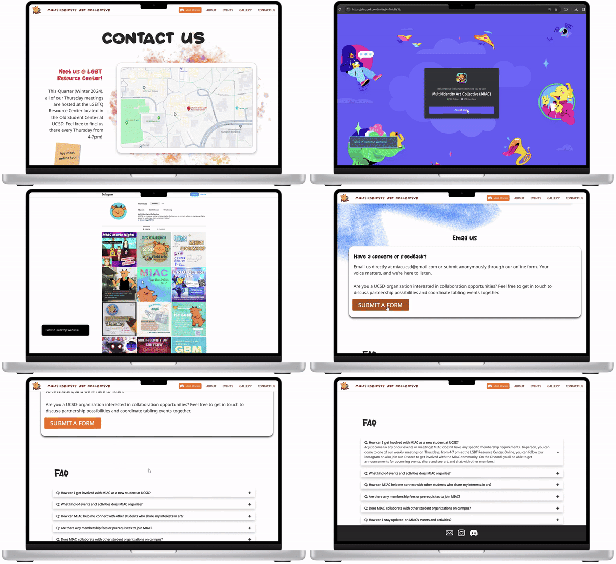
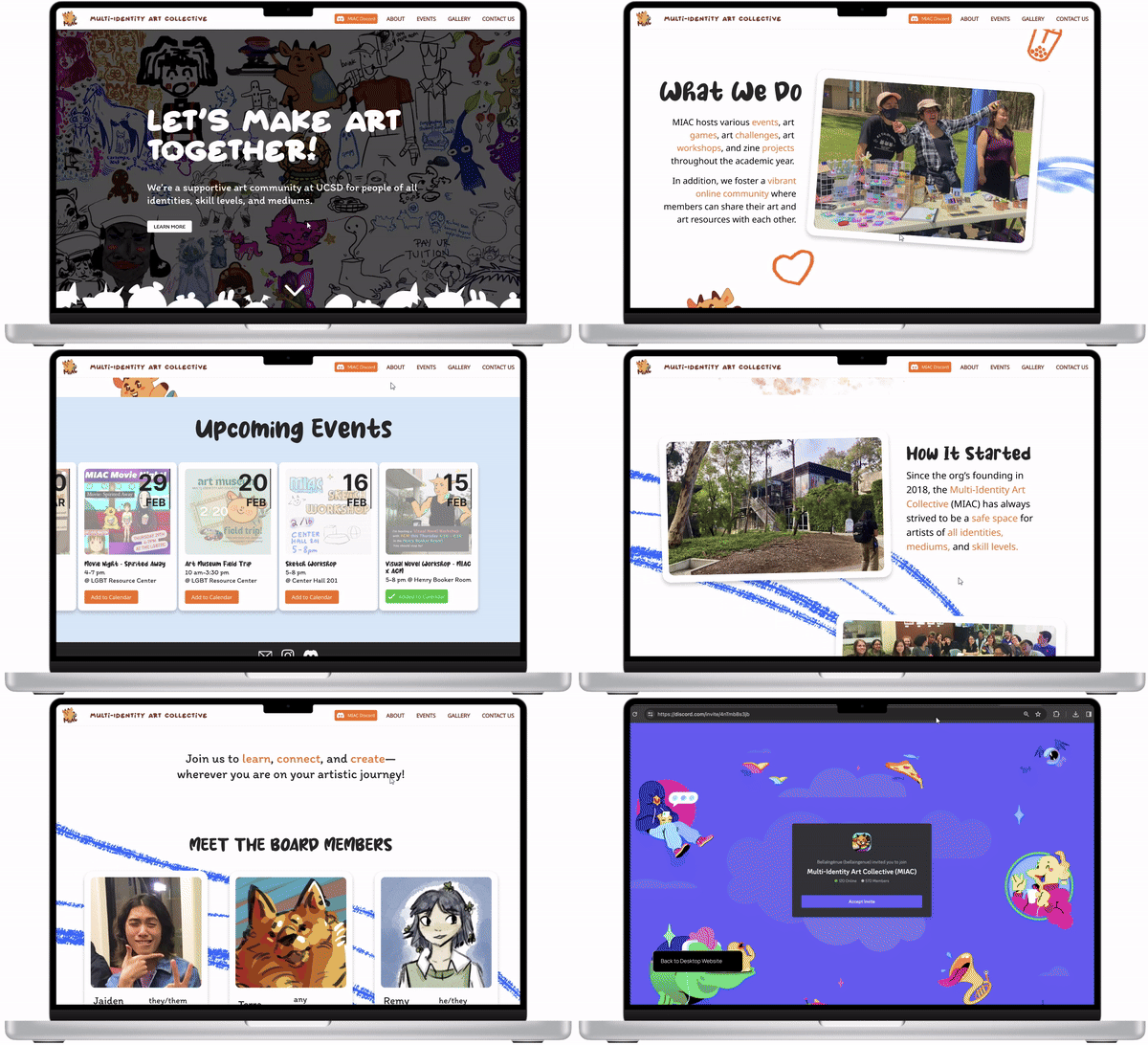

I first sent out a survey to the organization to learn about what our clients were looking to achieve with their redesign, gathering insights on their target audience and who they are as an organization. The majority of new attendees don’t know where the venues for events are since the organization was forced to go remote due to COVID-19. It is also unclear to newer members what differentiates MIAC from other art clubs.
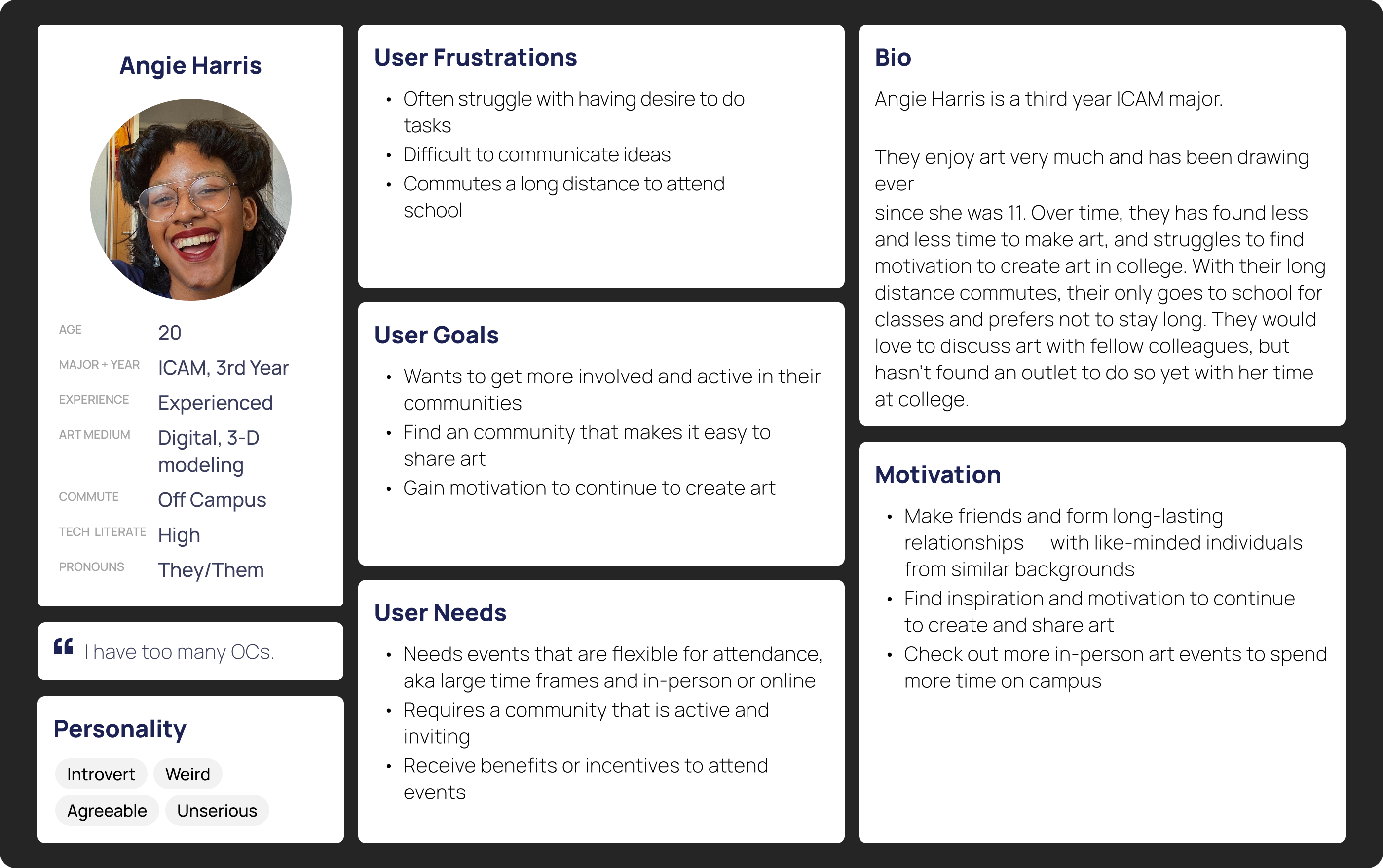
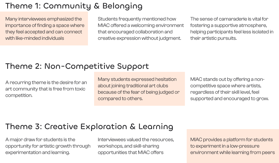
After learning about how people inside of the organization felt about MIAC, my team and I conducted interviews with 9 individuals who pursue art and developed user personas based on the interviewees. I’ve asked them questions below to find trends for motivations to join art communities and what they currently know about MIAC.
Research Questions
From the user interviews, many other organizations had simple navigation and had all the relevant resources that non-members would need. I analyzed two of the biggest organizations on campus to see how they organize their websites. I found that they made it easy to register for events as well as having clear methods of contacting them.

Based on the trends from the competitive analysis and insights from various students on campus, I’ve noticed how people find it difficult to join already established communities, especially if they do not know much about the organization. Trying to mitigate this fear that students have by providing them with the resources necessary to help guide their joining decision is an important aspect to consider when developing the website.
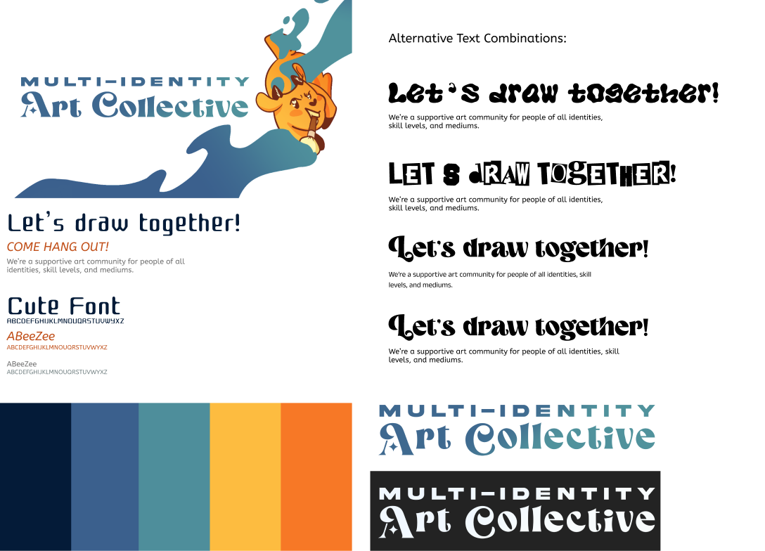
We spent a lot of time experimenting with the style for the website while developing the website. This slowed down our design process by at least a week because we would have inconsistent designs and would have to realign ourselves on our styling. After taking the time to touch base and develop a style guide, it helped us meet our tight deadline of 10 weeks for this redesign.
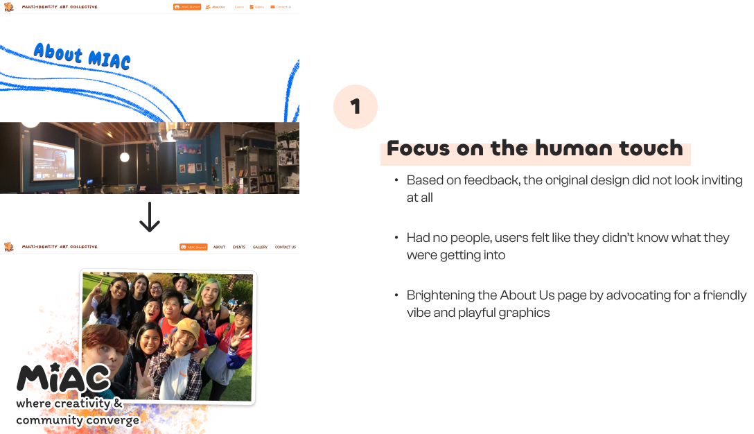
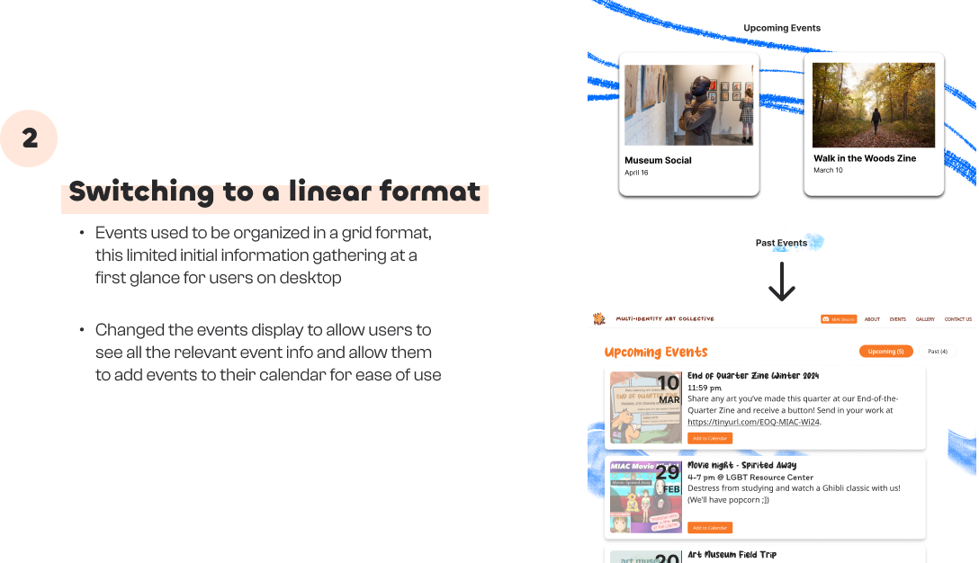
Based on various feedback from our TAs, I continually iterated over my screens over the span of 2 weeks with 2 major improvements:
This was my first reaching out to a client and offering to redesign their website. It was a challenging experience that taught me a lot about how to work with outside clients and making sure that their needs are met. With that being said, here are some things I would’ve done differently:
